


Digital accessibility isn’t just about compliance — it’s about creating inclusive experiences that work for all users, regardless of their abilities. Whether someone navigates with a keyboard, relies on screen readers, or has difficulty distinguishing colours, putting in effort at the development stage helps ensure everyone can access and interact with digital content effectively.
If you’re new to accessibility, the landscape can seem overwhelming. Where do you start? What are the most important principles to understand? How do you know if your work is actually accessible?
This guide cuts through the complexity to give you a practical foundation in digital accessibility. Although by no means exhaustive, it covers the fundamentals that will help you build more inclusive digital products from the start.
Principles
Permalink to "Principles" headingThe key accessibility concerns you need to be regularly checking are:
- Keyboard behaviour, particularly for interactive elements
- Semantic labels that can be understood by assistive technology e.g. screen readers
- Colour, including contrast ratios for all element states
- Content, including images and microcopy
- Performance, including loading states
- The ability to support user preferences (like resizing content and reducing motion)
ARIA roles and attributes modify the accessibility tree, changing how assistive technology presents the content to your users.
You get them included ‘for free’ with semantic HTML elements, so make sure to use those first. Custom components should build on top of semantic HTML elements and add ARIA only when necessary. ARIA doesn’t change anything about an element’s function or behaviour — when not using semantic HTML elements for their intended purpose and default functionality, you must use JavaScript to manage behaviour, focus, and ARIA states.
<a href="/">Do this!</a>
<span role="link" onclick="..." class="link">
  Don’t do this
</span>
No ARIA is better than bad ARIA — using ARIA incorrectly can overwrite native accessibility information and unintentionally cause a worse experience for people who use assistive technology. Always test any changes, particularly with a keyboard and a screen reader.
These W3C ARIA Design Patterns set out best practices for ARIA as well as expected keyboard behaviour for many common UI patterns.
Keyboard navigation
Permalink to "Keyboard navigation" headingNavigation order
Permalink to "Navigation order" headingThe default keyboard navigation order of headings, interactive elements and other landmarks must be logical and intuitive. This generally means that it follows the visual flow of the page: left to right (or right to left), top to bottom (or even bottom to top!).
Ask yourself: Does the tab order make sense? Does it provide any unnecessary difficulty for completing core tasks on the page? If the order feels wrong, consider whether it can be fixed by changing the layout of elements on screen (recommended), or if the tab order might need to be changed programmatically.
Any particularly important interactive elements should be at the top of the navigation order, such as a “Skip to content” link or a button to get help.
Be wary of how many interactive elements are on a single page — long lists of links or other navigable items may pose a burden for keyboard-only users. Aside from reducing the number of interactive elements, this can be improved for non-sighted users by using a proper heading structure and with regions or ARIA landmarks (<main>, <nav>, etc.).
Interactive elements
Permalink to "Interactive elements" headingAll interactive elements (e.g. buttons, links, menus, inputs) must be accessible by keyboard. Using semantic elements should ensure that this is the case (provided they are used correctly), so use these wherever possible.
Where a custom control is needed, you may need to use tabindex="0" to ensure an element can receive keyboard focus. ARIA may also be necessary to ensure that the control or widget is presented correctly to screen reader users, as well as additional code to make interactions work with both a keyboard and a mouse. Page elements that are not interactive to mouse or touch users should not be made keyboard focusable.
If you can interact with it, it should be on the screen — reaching an invisible link when tabbing through the navigation can be very confusing. Make sure that interactive elements in collapsed menus cannot be reached by the keyboard if the menu is closed. Something like a “Skip to content” link that is primarily for screen reader users can be visually hidden, but should be made visible when focused.
Focus states
Permalink to "Focus states" headingAny interactive element needs additional styles to show when it is being focussed by the keyboard. Each browser has its own built in styles for this, which are normally adequate.
It is possible to disable the default browser focus styles — by setting outline: none on your element — but you should do this only if you implement your own styled alternative. If you do decide to roll out your own styles, be sure to use more than just colour as a modifier: add an outline or an underline or some other visual indicator to support users with colour-blindness.
Focus traps
Permalink to "Focus traps" headingA focus trap is a design element that keeps a user’s attention within a specific area of a webpage, commonly used to ensure keyboard navigation remains within certain interactive components like modals or menus.
The Web Content Accessibility Guidelines (WCAG) state that if keyboard focus can be moved to a component of the page using a keyboard interface, then focus can be moved away from that component using only a keyboard interface. This should ideally be made possible using standard exit methods (like a close button or the Escape key) or arrow/tab keys.
Semantic labels
Permalink to "Semantic labels" headingHere are some of the most common issues screen reader users face that you should look out for when testing with a screen reader:
- Interactive elements like menus, tabs, and dialogs do not behave as expected
- Links or buttons do not make sense
- Screens or parts of screens change unexpectedly
- Images with missing or improper descriptions (
alttext) - Complex or difficult forms
- Missing or improper headings
- Too many links or navigation items
- Complex data tables
- Inaccessible or missing search functionality
Many of these issues can be solved by making sure that each on-screen element is properly labelled, so that it can present appropriate information to the users of screen readers and other assistive technologies.
Consider the following for each on-screen element:
- Type: What type of thing is this? Many semantic elements in HTML have a built-in role, for example
<button>has the “button” role. Non-semantic elements, such as<div>and<span>, do not have a default associated role. Theroleattribute can provide semantics when the HTML element isn’t sufficient, but it’s preferable to use a suitable semantic HTML element where possible. Some roles require the inclusion of associated ARIA states or properties; others are only valid in association with other roles (e.g. “list” and “listitem”). - Label: What is the name of this thing? Whether an element should (or can) have a name depends on the element’s role; for example, a
<div>(without an added role) or a<p>should never have an added name. Try to use a visible label where one exists, e.g. the text content of a button, rather than adding an invisible label usingaria-label, to make maintenance simpler and prevent potential bugs. All labels on the page should be unique and specific. Don’t repeat the component’s type in the label. There is a hierarchy that screen readers use to decide what the name is when multiple are specified. The ARIA Authoring Practices Guide has a thorough guide on providing accessible names and descriptions. - States & values: Does this thing have other properties/states that are critical to understand? E.g. orientation, position in a set, whether it is selected, checked, or disabled. Like with roles, these are often accessed through a semantic HTML element. There are additional ARIA attributes available to be used, but many of them are only available to be used in certain circumstances.
As previously mentioned, you get many of these things ‘for free’ when using semantic HTML elements, so additional ARIA roles, labels and attributes are often not needed. For example, using <input type="checkbox"> with a programmatically associated <label> gives you the “checkbox” role, an accessible name and access to a “checked” state automatically, without needing to add role="checkbox", an aria-label or aria-checked.
<input type="checkbox" name="my-checkbox" id="my-checkbox" />
<label for="my-checkbox">My checkbox</label>
Colour is an effective way to convey meaning, but it’s always a good idea to have a second visual indicator for people with low vision or colour vision deficiencies, such as text or an icon.
In WCAG 2, contrast is a measure of the difference in perceived ‘luminance’ or brightness between two colours. There are minimum ratios of contrast (between background and foreground) that must be met under WCAG’s AA and AAA standards. These requirements apply to text, including text within images.
In most situations, the minimum ratio for WCAG AA standards is 4.5:1, except:
- When using large scale text (greater than 18pt, or bold and greater than 14pt), the minimum ratio is 3:1
- If text is incidental e.g. inactive or purely decorative, there are no contrast requirements
- In a logo, where there are no contrast requirements
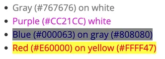
Gradients and background images need to be considered carefully for how they impact contrast ratios. Transparency/opacity will also impact contrast - making a foreground element more transparent will reduce the contrast against the background.
Watch out for contrast ratios on disabled, hover and focus states: these are often forgotten, but the same rules apply.
Many automated testing tools will pick up on contrast issues, but if in doubt, check it manually — whocanuse.com is a great place to do this.
Content
Permalink to "Content" headingUse simple language — don’t use a lot of long, complicated words when a few simple ones will do. Check out our blog post on Pattern based UX content for ideas on how to write effective copy.
Use the image alt attribute to explain what the image contains in context of the surrounding text. If the image contains mainly text, the alt value should match that text. Don’t include “Image of…”, “Picture of…” etc. in alt text, as screen readers handle this.
If an image is a meaningless presentational graphic, set alt=""; an empty string is used rather than removing the attribute, as if an alt attribute is missing, screen readers will read out the image filenames instead, which are often not very useful!
Provide an alt attribute even if a caption is provided. The alt text should describe the image, whereas the caption should provide the context.
If an image is also a link, the alt text should describe the destination of the link, rather than just what the image shows.
Avoid using “Click here”, “Read more”, and other non-descriptive labels for links and buttons. When navigating the page via keyboard, a screen reader user will hear ‘link, you are on a link, click here’ with no explanation of what that link is or where it goes. Instead, use short, descriptive, words to explain what the CTA does or where it will take users.

This a11y collective article on links gives lots more guidance about link accessibility.
Performance
Permalink to "Performance" headingScreen readers cannot parse the page and create their accessibility tree until the DOM has loaded. So whilst making a performant website benefits all, it’s especially beneficial for screen reader users.
This article from All Accessible and the Carbon Design System both give practical tips on how performance and loading can be optimised for accessibility.
Testing
Permalink to "Testing" headingThe guide on accessibility tools from MDN Web Docs gives a useful overview of accessibility testing techniques and tooling, and there are many accessibility testing checklists available online, such as this WCAG compliance checklist from the A11y Project.
Many issues can be debugged using the Accessibility tab in the browser’s developer tools, such as this one in Chrome.
Both automated and manual testing should be carried out to ensure different types of potential problems are caught.
Automated (and semi-automated) testing
Permalink to "Automated (and semi-automated) testing" headingThese tests run automatically (or are triggered by pressing a button) and can detect many types of issues within seconds. They cannot tell you if your web content is accessible, but they can help you, as a human, evaluate the accessibility of your web content.
- WAVE (Web Accessibility Evaluation Tool): a suite of tools including a browser extension. Useful for checking:
- Errors and warnings, such as for colour contrast ratios and missing input labels
- Navigation order
- Structure
- What does the document contain without any styling - does it make sense? The DOM order should match the visual order
- axe DevTools: similar to WAVE, and also has a browser extension
- Storybook accessibility tests: uses the axe-core library for testing components in Storybook
- Storybook interaction tests: Etch’s addon for Storybook to test interactive components against W3C ARIA Design Patterns
- CI: Tests should be run against all pull requests to make sure there has not been any regressions
Manual testing
Permalink to "Manual testing" headingAutomated accessibility tests can’t catch every issue, so manual tests are essential.
- Semantic HTML: Validate the HTML using something like W3’s validator
- Keyboard navigation: Check that all interactive parts can be accessed and controlled using only a keyboard. This resource on keyboard accessibility lists potential problems to look out for and common keyboard interactions with different types of UI.
- Screen reader: Everything should be sense-checked using at least one screen reader. Make sure that everything can be accessed, and that sensible names, roles and any important states are being read out.
- User preferences: Check that user preferences like zoom level and
prefers-reduced-motionare supported.
Conclusion
Permalink to "Conclusion" headingBuilding accessible digital experiences doesn’t have to be overwhelming when you approach it systematically. The key is to integrate accessibility into your development workflow rather than treating it as an afterthought. When shipping a new feature or change, consider following this approach:
- Start with semantic HTML and build your components using the right elements for their purpose
- Test early and often using automated tools like WAVE or axe DevTools during development
- Manual keyboard testing should become second nature — tab through your interface and ensure it makes logical sense
- Validate your HTML and check colour contrast ratios before considering the work complete
- Check with a screen reader to verify that your labels and ARIA implementations work as intended
- Run automated tests in your CI pipeline to catch regressions before they reach users
Remember that accessibility is an ongoing practice, not a one-time checklist. As you build more accessible interfaces, these considerations will become natural parts of your development process. The investment in accessibility pays dividends not just for users with disabilities, but for everyone who interacts with your digital products.
Most importantly, when in doubt, test with real users. The principles and tools outlined in this guide provide a strong foundation, but nothing replaces feedback from people who actually rely on assistive technologies in their daily lives.