Bring clarity to your components
Diamond UI is a method of organising and grouping components to cleanly separate their responsibilities.
As a bespoke software studio, Etch creates interfaces over a wide range of brands, timelines and technologies. After 20 years of trying different methodologies, from SMACSS, to OOCSS, to Bootstrap style, to Atomic Design, we’ve settled on our own organisational framework: Diamond UI.
What is Diamond?
A diamond’s quality is determined by the 4 Cs: cut, colour, clarity and carat.
Diamond UI is a method of organising and grouping components to cleanly separate their responsibilities. This results in a UI ecosystem that is robust, reusable, extremely flexible, very testable and low maintenance. The methodology does not dictate any technology or naming constraints.
Components are grouped into one of four areas, aiming to be concerned with fulfilling a single area of responsibility.
Diamond UI components are based around the 4 Cs of UI:
- Composition
- Canvas
- Content
- Controls
Composition
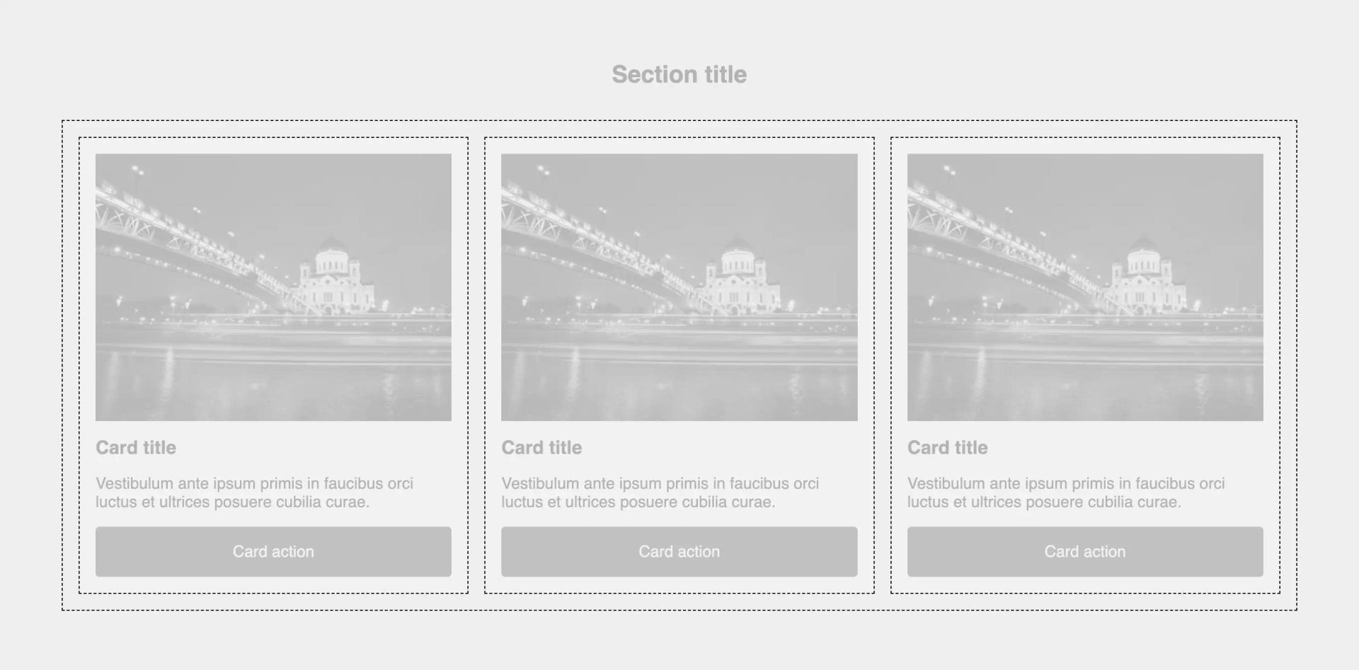
Compositions are an invisible element of the page that provides layout. Compositions are solely concerned with creating structure and spacing.
Typical examples of a composition component are:
- Grid - creates layout with grid cells arranged in columns and rows
- Spacing - creates spacing between components or areas of the page
- Container - sets a max width for a page, block of content or components

https://codepen.io/gavmck/pen/ExLNbbg
Canvas
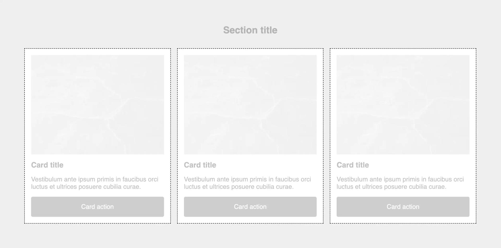
A canvas represents a coloured box on the page that content can be poured into.
Canvases generally sit within a composition element to give them a layout context or they will flow outwards to fill the space.
Canvases can provide padding for their content area, but should not generally dictate any other layout constraints.
Typical examples of canvas components are:
- Card - a box, often presented with an image, title, text and a CTA
- Navbar - a floating element at the top of the page, containing the logo and main navigation
- Hero - the first element in the main content of the page, containing the title and intro

https://codepen.io/gavmck/pen/vYjypKv
Content
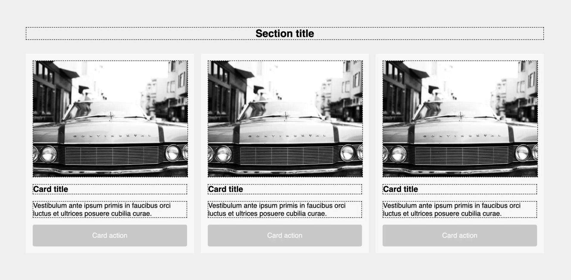
Content components are focused around text and images and the base level, but can extend into more specialised areas such as a person or a product. Content components are where the UI library can become more specialised towards the industry or product that the library is serving.
Typical examples of content components are:
- Heading - title elements, represented in HTML as h1-5
- Text - a piece of typographic content
- Icon - a glyph representing something in the app ecosystem
- Person, ProductSummary, PaymentDetails - product/industry specific content

https://codepen.io/gavmck/pen/bGMBLgR
Controls
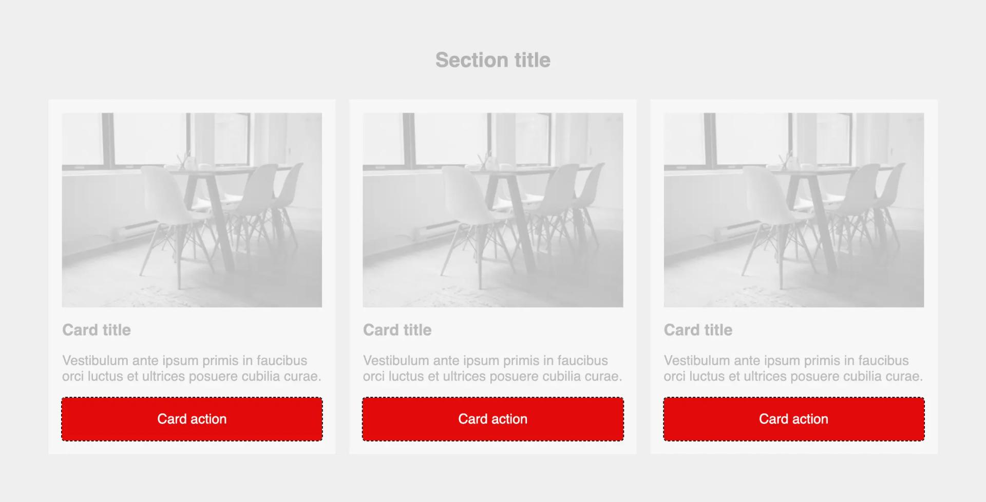
Controls are interactive elements of the page. Anything that can be clicked, dragged, typed into or accessed in some way with the mouse, keyboard or touch is a control.
Typical examples of controls are:
- Button - a clickable component that triggers an action, such as submitting a form
- Link - a hypertext link that takes the user to another page or section of the app
- Input - a form input that allows users to enter information

https://codepen.io/gavmck/pen/NWMbyaw
Why Diamond?
- Diamond UI components are small and easy to understand.
- With clear boundaries between them, it’s immediately obvious when a component is trying to overstep its area of responsibility and become a later piece of tech debt.
- With minimal onboarding, most developers can quickly understand where to find each type of component.
- Diamond components are less prone to prop bloat, by scoping to a single area of responsibility. They automatically favour composition over inheritance.
- With fewer output variations, Diamond components are easier to test.
- Diamond components have simple interfaces and less complicated props to understand.
- Diamond solves future problems, by being extremely flexible. Components can be constructed in thousands of combinations to suit the context.
- Diamond components retain human legibility when compared to a utility-first framework, whilst staying almost as flexible.
Bring clarity to your components
We’re building Diamond UI — a development resource to help organise interface components.