


When we built Evergreen, WRAP’s design system, nobody asked us to make it lightweight. The brief was to create a component library that worked across content websites, data-heavy tools, and embedded plugins on third-party sites. We needed it to be accessible, maintainable, and flexible enough for teams with very different needs.
The tiny footprint was a natural consequence of the design decisions we made along the way. Every component, every style, and the full Lit runtime compressed into just 48KB when gzipped. Add WRAP’s branded fonts and the total comes to around 125KB. To put that in perspective: React alone weighs roughly 40KB, before you’ve built a single thing with it.
We didn’t achieve this by obsessing over bundle size. We achieved it by applying a consistent set of principles throughout the project. Here’s what they are, and how you can apply them to your own work.
1. Start with zero JavaScript and justify every byte you add
Permalink to "1. Start with zero JavaScript and justify every byte you add" headingMost design systems begin with a JavaScript framework and build everything on top of it. React, Vue, Angular — the components are written in JavaScript, rendered by JavaScript, and sometimes styled by JavaScript too. That’s a lot of JavaScript for things that often amount to “put a coloured box on the screen with some text in it.”
We start from the opposite direction. Every component begins life as pure CSS, and we only introduce JavaScript when we hit something CSS genuinely can’t do.
Evergreen has 37 components. 25 of them contain zero JavaScript. They’re what we call CSS web components — custom elements that use web component syntax for the developer experience but never register themselves with the browser’s CustomElementRegistry. This is perfectly valid HTML. The browser treats them as custom elements with CSS attached, and your editor gives you full TypeScript completion and prop validation.
Take the grid component. It handles alignment, column spanning across breakpoints, gap control, grow and shrink. That’s a decent chunk of layout logic, but none of it needs JavaScript — CSS flexbox handles all of it:
<evg-grid wrap="wrap" gap="lg">
  <evg-grid-item small-mobile="12" tablet="6" desktop="3">
    ...
  </evg-grid-item>
</evg-grid>
Type-safe, composable, zero JavaScript.
The remaining 12 components use Lit, a lightweight web component framework (~5–6KB). We reach for it when a component genuinely needs shadow DOM subtrees, named slots, or JavaScript-driven interaction. The collapse component needs JavaScript to coordinate open/close timing. The icon component uses Lit to render SVGs and lazy-load branded icon sets. The radio-checkbox component needed a shadow DOM subtree to control its custom indicator layout.
How to apply this: Build a decision tree for your team. Ours works like this:
- Start with a utility class when you need to apply a single style to any element — semantic HTML or existing components. Text size, spacing, theming.
- Move to a CSS web component when you need multiple props with type completion, but no shadow DOM subtree. This is the sweet spot — full developer experience, zero runtime cost.
- Reach for a full web component only when you need shadow DOM rendering or JavaScript-driven interaction.
If you’re adding four utility classes to something, it probably wants to be a CSS web component. If your CSS web component needs to render children into a subtree, it’s time for JavaScript. Always justify the step up.
Two of our 12 Lit components could probably be pure CSS now. CSS keeps getting more capable — scroll-driven animations might let us convert our enter-on-scroll component next. Revisit your JavaScript components periodically and ask whether the platform has caught up.
2. Design the system before you design the components
Permalink to "2. Design the system before you design the components" headingPerformance wasn’t just an engineering outcome on Evergreen. It was baked into the design process.
Our designers pulled apart every content type WRAP needed — campaign pages, data dashboards, embedded plugins, long-form articles — and instead of designing bespoke components for each context, they looked for the underlying patterns. What spacing relationships appear everywhere? What typography combinations keep recurring? How many distinct surface treatments do you actually need?
This is the difference between designing components and designing a system. A component-first approach produces a library where each component is self-contained and fully featured. A system-first approach produces a small set of foundational decisions — spacing scales, type hierarchies, colour relationships, interaction patterns — that naturally generate the components you need.
How to apply this: Before you design a single component, document your foundational decisions. How many spacing values do you actually need? How many font sizes? How many surface colours? Evergreen uses seven spacing tokens, fourteen font sizes, and ten theme combinations. Those constraints aren’t limitations — they’re what make 37 components enough to cover three very different types of website.
When a designer says “I need a new component,” ask whether the existing pieces can be composed to achieve the same outcome. More often than not, the answer is yes — and the system stays lean.
3. Compose small pieces instead of configuring big ones
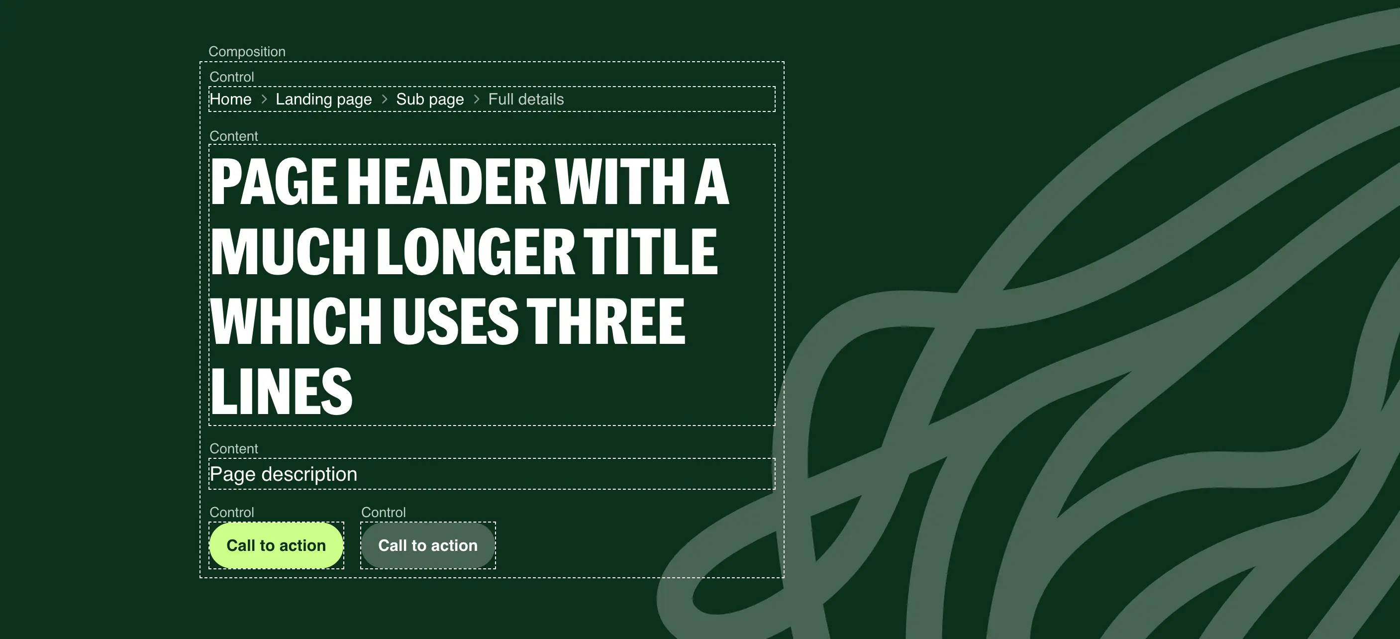
Permalink to "3. Compose small pieces instead of configuring big ones" headingEvergreen uses Diamond UI to organise components into four groups: canvas, composition, content, and control. This isn’t a filing system. It’s a design constraint that keeps components small, single-responsibility, and composable.
- Canvas — a coloured surface. Think of it like a painting canvas: anything can go inside it, and it doesn’t care what. Sections, cards, alerts, boxes.
- Composition — invisible layout structure. Grids, wrappers, rows. You can’t see them in the output, but they organise what’s inside.
- Content — information display. Icons, badges, stats. Many HTML elements are already content components:
h1,p,img. - Control — interactive elements. Buttons, links, form inputs.
Here’s why this matters for bundle size. Think about a typical hero component in a conventional design system. It accepts props for an image, title, subtitle, eyebrow text, a CTA button, and its action. That’s six or seven props. Then a team asks for a second CTA, so you add two more. Then someone wants a link inside the subtitle, but it’s a string prop — so you refactor to accept HTML, introducing a breaking change for every consuming team.
Each of these additions makes the component heavier, more complex, and harder to maintain. Multiply this across a whole library and you end up with a system full of complicated, overlapping components.
In Evergreen, a hero is just a canvas component. The title is an h1 with a text size utility class. The buttons are control components. The layout between them is a composition component. Need a second button? Drop it in. The canvas doesn’t care about its children. Need a link in the introduction? It’s just HTML — nothing breaks because no component was trying to own content that wasn’t its responsibility.
How to apply this: When you’re designing a new component, ask which Diamond UI group it belongs to. If the answer is “more than one,” you’re building something too big. A card that handles its own layout, displays content, and contains interactive elements is doing three jobs. Split it into a canvas (the card surface), composition (the content layout), and let the content and controls be whatever they need to be.
The result is fewer components that combine in more ways. Fewer components means less code to ship, less to test, and less to maintain.
4. Wrap the platform, don’t replace it
Permalink to "4. Wrap the platform, don’t replace it" headingThis principle is especially relevant when you’re working with web components. If you’ve come from React or Vue — which are essentially templating frameworks — it’s easy to carry that mindset over and start rendering semantic HTML inside shadow DOM. The component creates its own button or input internally, hidden away from the rest of the page. But shadow DOM can bury semantic content where assistive technologies, browser features, and other tools struggle to reach it.
<evg-button variant="primary" type="submit">
  Save and continue
</evg-button>
The thing we keep coming back to is: web components are not templates. They’re extensions of the HTML spec. You wouldn’t expect a native details element to create its own hidden button inside shadow DOM — it wraps the content you give it. Web components should work the same way.
Evergreen’s components are thin wrappers around semantic HTML that already exists in the light DOM. An evg-button wraps a native button. An evg-modal wraps a native dialog. The semantic elements are right there in the markup — they don’t need JavaScript to render them into existence.
<evg-button variant="primary">
  <button type="submit">Save and continue</button>
</evg-button>
The evg-button handles visual presentation. The native button handles semantics, keyboard interaction, form submission, and accessibility — things the browser already knows how to do.
In a React or Vue component library, the rendered output still ends up in the light DOM, so the semantic elements are accessible regardless. But those elements only exist once the framework’s JavaScript has downloaded, parsed, and executed. With Evergreen’s approach, the semantic elements are already in the HTML. The button is a working button before any JavaScript runs. The dialog is a real dialog. All the native attributes — type, disabled, aria-label — are available directly on the element without being abstracted behind component props.
This pays off in three ways.
Less code. The native dialog element gives us focus trapping, backdrop behaviour, and escape-to-close for free. We didn’t write JavaScript for any of that.
Better accessibility. Semantic elements in the light DOM mean the browser’s accessibility tree works as expected. No polyfills, no ARIA workarounds, no custom keyboard handling to recreate behaviour the platform provides natively.
More resilient. If JavaScript fails to load, a native button inside evg-button is still a clickable button. A native dialog is still a dialog. The components degrade gracefully because the semantic foundation is always there.
How to apply this: If you’re building web components, resist the urge to render semantic elements inside shadow DOM. Wrap them instead — keep them in the light DOM and let the web component handle presentation. If you’re working in a framework like React, consider whether the framework is adding value beyond rendering elements that could already exist in the HTML. Push semantic HTML and ARIA as far as they’ll go before introducing JavaScript. The browser is better at being a browser than your code is.
5. Test against the platform’s own standards
Permalink to "5. Test against the platform’s own standards" headingIf you’re building on top of the platform, you should be testing against the platform’s own accessibility standards — not just checking for common mistakes.
Evergreen runs automated accessibility checks on every single Storybook story through axe and Playwright. That catches static issues like missing labels, insufficient contrast, and incorrect ARIA attributes.
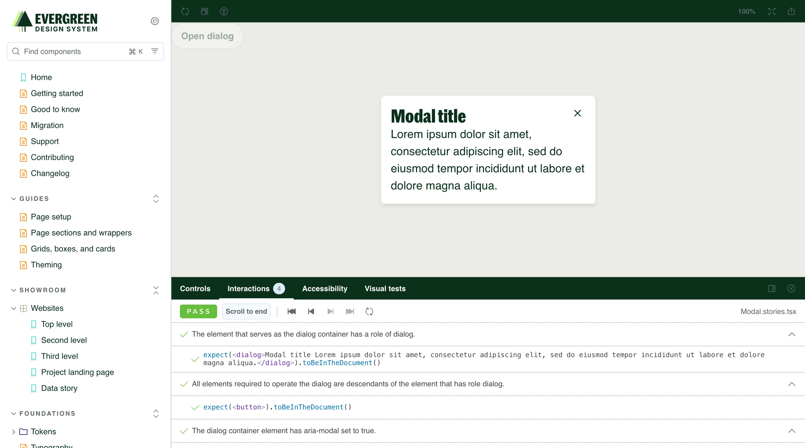
But static analysis only tells you half the story. The W3C publishes detailed interaction pattern specifications for components like modals, disclosure widgets, and form controls. These describe expected keyboard behaviour, focus management, and screen reader interaction — things like “focus should move into the modal when it opens” and “pressing Tab should cycle within the modal while it’s open.”
We turned those specifications into reusable interaction tests and plugged them into Evergreen’s test suite. So our modal isn’t just checked for static issues — it’s tested against the W3C’s specification for how a modal should actually behave when someone interacts with it.
This feeds back into the lightweight approach. When you use the native dialog element, most of these interaction tests pass out of the box. The browser already implements the W3C’s expected behaviour. When you build a custom modal from div tags and JavaScript, you have to implement and maintain all of that yourself — more code, more tests, more things that can break.
How to apply this: Don’t stop at running axe against your components. Look at the W3C’s APG (ARIA Authoring Practices Guide) for each interactive pattern you build, and write tests that verify the expected keyboard and focus behaviour. If those tests are hard to pass, that’s a signal you might be fighting the platform instead of working with it. Consider whether a native element would get you most of the way there.
The numbers
Permalink to "The numbers" headingHere’s how Evergreen compares to other design systems in terms of what actually lands in the browser:
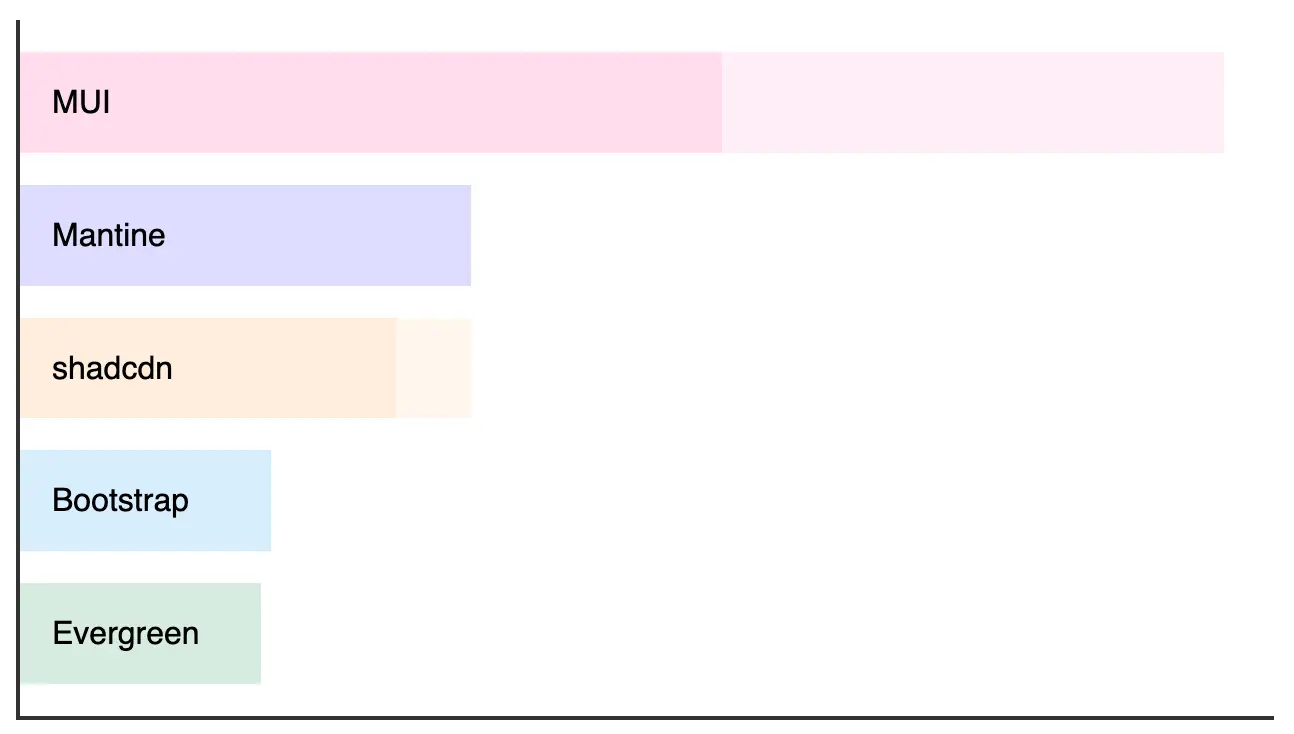
| Library | Core CSS + JS (gzipped) | Notes |
|---|---|---|
| Evergreen | ~48 KB | Full library including Lit runtime |
| shadcn/ui + React | ~75–90 KB | React (~40 KB) not included in component size |
| Mantine + React | ~90 KB | React (~40 KB) not included in component size |
| Bootstrap | ~50 KB | CSS framework + JS, not a typed component system |
| MUI + React | ~140–240 KB | Depends on components used |
Most React-based systems don’t include React itself (~40KB) in their reported sizes. When you account for the framework runtime, Evergreen’s total cost is consistently lower.
The comparison that matters most for WRAP is the embedded use case. Their recycling locator plugin sits on council websites and third-party pages across the UK. Every kilobyte Evergreen adds is a kilobyte someone else’s users have to download. 48KB is a very different proposition to 200KB — especially for users on older devices or slower connections.
What this adds up to
Permalink to "What this adds up to" headingThere’s a neat symmetry in building a lightweight design system for a sustainability organisation. WRAP exists to reduce waste. Evergreen reduces digital waste — unnecessary JavaScript, redundant components, framework overhead that serves developers more than users.
But these principles aren’t specific to sustainability clients. They apply to any design system where you care about the people who actually use what you build. And the platform keeps making this approach easier.
In the last few years, we’ve gained container queries (so components can respond to their parent’s size rather than the viewport), the :has() selector (letting CSS respond to component contents without JavaScript), native CSS nesting, @starting-style for entry animations without keyframes, content-visibility for rendering performance, and dialog with its built-in focus trapping and backdrop. CSS color-mix() lets us derive colour variants from tokens without a preprocessor. @layer gives us cascade control that used to need careful specificity management or !important overrides. Scroll-driven animations are landing in browsers now and will likely let us convert more of our JavaScript components to pure CSS.
Every one of these features removes a reason to reach for JavaScript. The gap between what the platform offers and what frameworks provide keeps narrowing — and the performance cost of that gap keeps getting harder to justify.
Start with zero JavaScript. Design the system before the components. Compose small pieces. Wrap the platform instead of replacing it. Test against its standards. You’ll end up with something lighter, more accessible, and more durable than you expected.