


Patterns Day 2024
Returning to the Duke of York 5 years later to learn about design systems.
The last Patterns Day took place in 2019. Five years later we're back at the Duke of York in Brighton.
We like a Clearleft conference. We've been to quite a few over the years: UX London, dConstruct and Responsive Day Out. They always know how to throw a good event and a couple of days in Brighton to catch up with the Etch team is never a bad shout.
Patterns Day focuses on the topic of design systems. If you're not familiar with the topic, a design system is a set of components and documentation to help teams build digital products.
At Etch, we work with a variety of brands to create and maintain their design systems, so Patterns Day is right up our street.
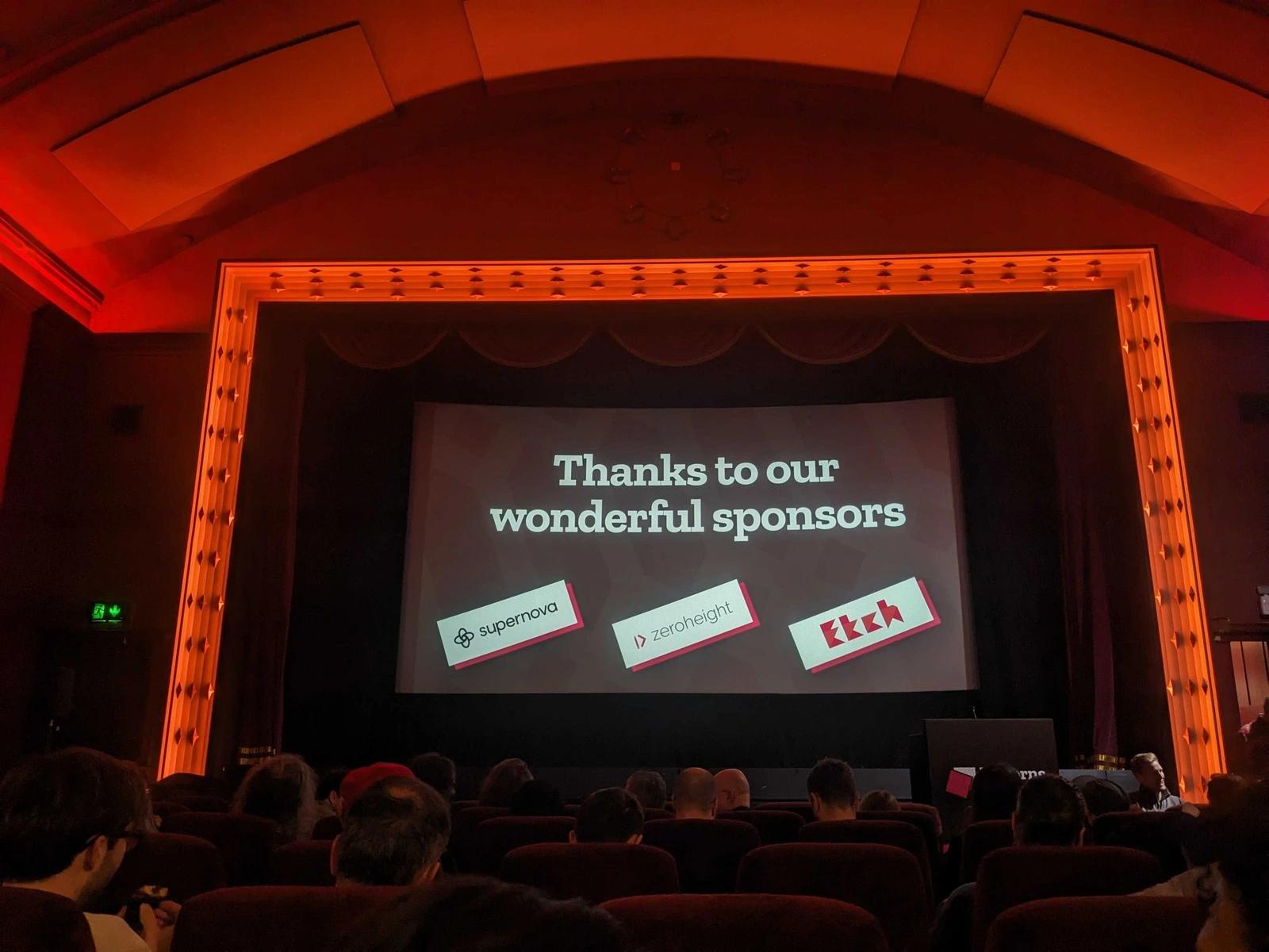
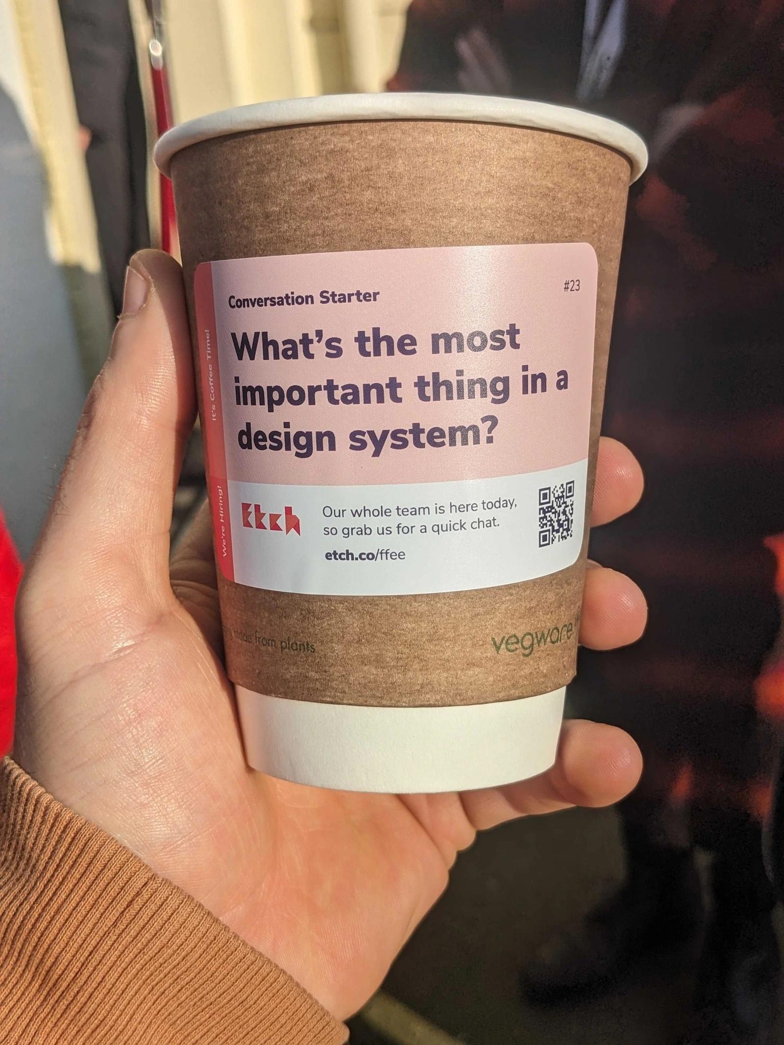
Proud to be a sponsor
Etch sponsored Patterns Day this year – helping to fuel attendees with tea and coffee throughout the day. It was fun to design the cup sleeves and we came up with 50 conversation starters to help get people chatting.
One of the best things about attending conferences is the conversations with people from other companies at the conference. I picked up a ton of tricks, tools and strategies just chatting away to people in the breaks.
What about the talks?
There were loads of great talks throughout the day and I'd like to highlight a few of my favourites and the takeaways from them.
Design tokens
Débora Ornellas gave a great talk about design tokens. Figma recently released Figma variables and 'dev mode' officially and lots of teams are currently converting over to use Figma variables. We've been using design tokens for a long ol' time at Etch, but it's interesting to see more teams putting the responsibility and management of tokens into designers’ hands.
I think there are pros and cons to this approach. We have traditionally let the developers name and manage the tokens, whilst trying to represent the values in the designs and the designer's brains as closely as possible. This can lead to inconsistency where a designer will create a new value, or have different mental models for tokens which can lead to frustration and some heavy refactoring.
On the other hand, developers’ brains are often a little more methodical and structured. We love our designers, but their creative minds are not always suited to creating predictable, structured token sets, which get imported directly to code.
The real gem in this feature is the fact that it gets developers and designers working more closely together to manage the tokens as a team. The more we use the same values and the same language, the better we can work together and the better the translation between the design tools like Figma, and the final code.
We've been trialling automated Figma tokens to code translation in a few projects for several months now and it's been working well. By having design tokens in Figma that directly translate to code that can be applied, there are much fewer lookups and guesswork to get the right value. Conversations around tokens across teams are much more streamlined as everybody is using the same language.
Community sourced components
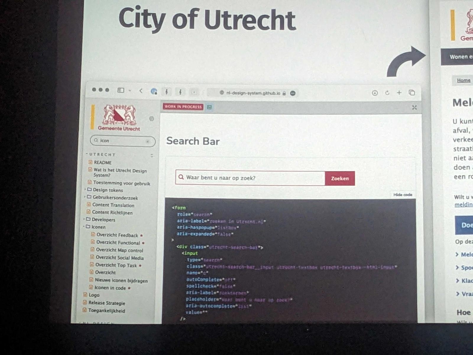
Yolijn van der Kolk from the NL Design System gave an awesome talk about developing the Dutch government's design system. The more stakeholders, user types and applications you have in a design system, the more complicated it is to hit the right balance between prescriptive and flexible. More consumers mean more variation and more requirements.
An approach they are taking in the NL Design System is community source components. Each local area of government that manages a site is developing its own components using the architecture guidelines from the core design system. After a trial period, battle-tested components can be proposed to be moved up to the core system.
We have several design systems at Etch that are consumed by multiple apps across different brands and this is an appealing approach. Often, you don't know if a component is worthy of adding to the core system before it's been used in a real production context with production data. By allowing consumer apps to trial components using architectural guidelines, you can beta test with real users before running reviews to bring components into the core framework.
A neat little bonus was to see that the NL Design System uses the component status tag plugin we developed for Storybook a few years ago. It's always a pleasure to see other people using our open-source work.
Ongoing accessibility
Geri Reid gave a very polished talk on accessibility in design systems. She described the joy of creating a set of components that enforce accessibility and then the horror of watching teams use these to build completely inaccessible apps.
It was encouraging to see another team struggling with the ongoing task of making sites as accessible as possible. Whilst we always try to enforce good accessibility programmatically with the sites and libraries we manage at Etch, there is always a large human element needing regular reviews to stay on top of the code that is in production.
Fluid typography
Richard Rutter spoke about fluid web typography and spacing, using the new CSS clamp() function to set upper and lower bounds for type scales and spacing. This creates very clean CSS by removing the need for breakpoints to bump type sizes on tablet or desktop and feels very 'web native' by using the fluidity that is inherent to the browser window.
We've been taking an approach that uses fluid typography and fixed 'UI' (buttons, inputs) sizes for a while now that feels very similar to this approach. I've recently been playing around with clamp() for fluid spacing units and just started trying it out for fluid heading sizes. It was great to see someone else coming to a similar conclusion and will help push to formalise this in our approach.
As a practical takeaway, Richard recommended using their tool Utopia to help generate fluid typography variables. I like these simple little tools on the web that you can dip in and out of that serve a small, dedicated, purpose.
Start small and sneak it out
Samantha Fanning spoke about their design system development at UCL. It's not out yet, so don't judge their current site!
Samantha emphasised starting small and being pragmatic. It's easy to get held back by adding too much process and worrying about creating the perfect system with all the documentation and all the components ready straight away to start using everywhere. Don't let great be the enemy of good. If you don't have real users using your system, you don't have anything so get something into production as quickly as possible and start learning and refining from there.
They also skipped the process by getting on with it and not asking permission. One of the best things you can do as a team is try to harness long-term benefits from short-term projects. A design system doesn't have to be a project in itself, but it can be a side outcome of a project that is already happening. By documenting components as they are built, and thinking about how they might be used in the future, you can start your design system today.
The final roundup
As the speakers shared their stories they each raised similar questions, but nobody seemed to have the answers. It appears there are a lot of teams out there, who are working on design systems and running into the same problems.
It gave us a lot of confidence in our approach which we'll be writing about over the coming months.