


Storybook’s accessibility plugin is brilliant at catching things you can see: colour contrast issues, missing alt text, dodgy heading hierarchies. But it has a blind spot. It doesn’t know what your component is supposed to do.
A tabs component should move focus when you press the arrow keys. An accordion should expand and collapse with Enter and Space. A combobox should announce the active option to a screen reader as you navigate the list. Storybook’s snapshot-based checks can’t test any of that — they just see HTML and judge whether it follows general good practice. They don’t know you built a tabs component, so they can’t check it behaves like one.
Our team manages several design systems across different clients and frameworks, and we manually test keyboard navigation and screen reader behaviour on every component. But things can fall through the cracks with manual test alone, where possible we wanted a way to back our manual tests up with automated ones that follow a spec and aren’t prone to human error.
So we built one. Or rather, we translated the existing specs into something we could automate.
The W3C already wrote the answers
Permalink to "The W3C already wrote the answers" headingThe W3C’s ARIA Authoring Practices Guide defines exactly how common UI patterns should behave: which roles elements need, how keyboard navigation should work, where focus should move, what states should change. It’s thorough, well-maintained, and respected — but it’s a reference document, not a test suite.
We went through the specs for every UI pattern we use across our design systems — accordions, tabs, buttons, checkboxes, comboboxes, modals, radio groups, switches, carousels, tables, links, alerts, and disclosure widgets — and turned each one into a set of interaction tests that can run inside Storybook’s test runner.
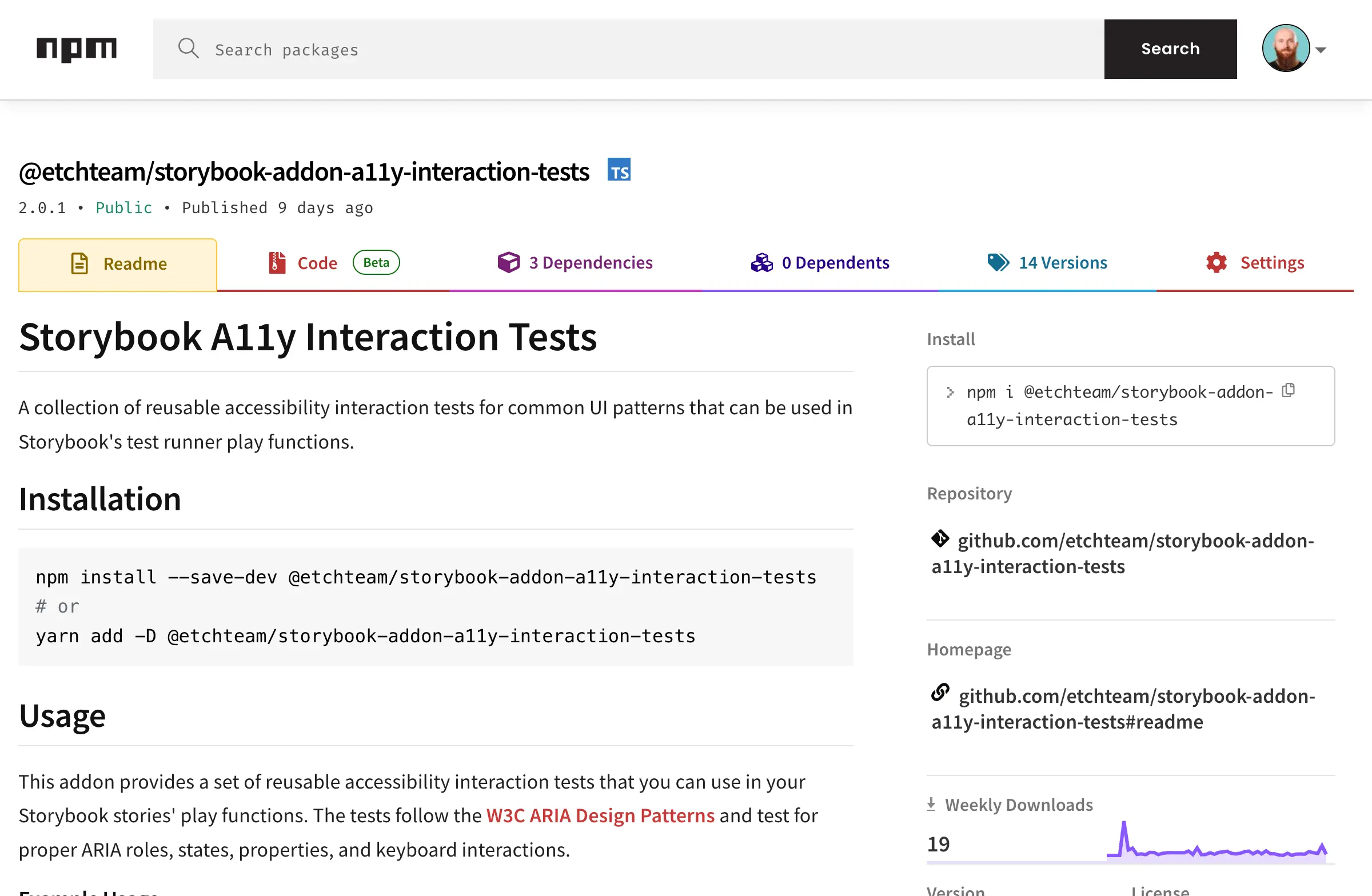
The result is an open-source npm package called @etchteam/storybook-addon-a11y-interaction-tests. It took about two to four weeks with two of us working on it, and it’s been catching accessibility issues for us ever since.
What the tests do
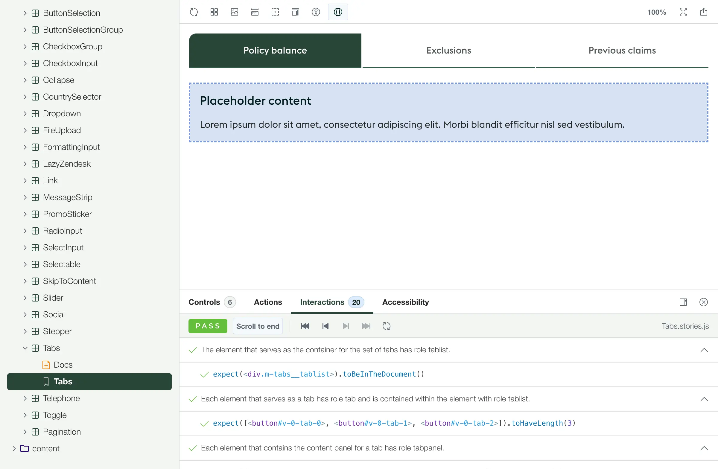
Permalink to "What the tests do" headingEach test function checks a specific UI pattern against the W3C spec. Take the tabs test as an example. When you run a11yTabs, it checks:
- that your tablist has the correct
role="tablist" - that each tab has
role="tab"and is properly contained within the tablist - that tab panels have
role="tabpanel"with correctaria-labelledbyreferences - that only one tab has
aria-selected="true"at a time - that arrow keys move focus between tabs correctly
- that Tab moves focus out of the tablist and into the active panel
- that focus management follows the expected patterns throughout
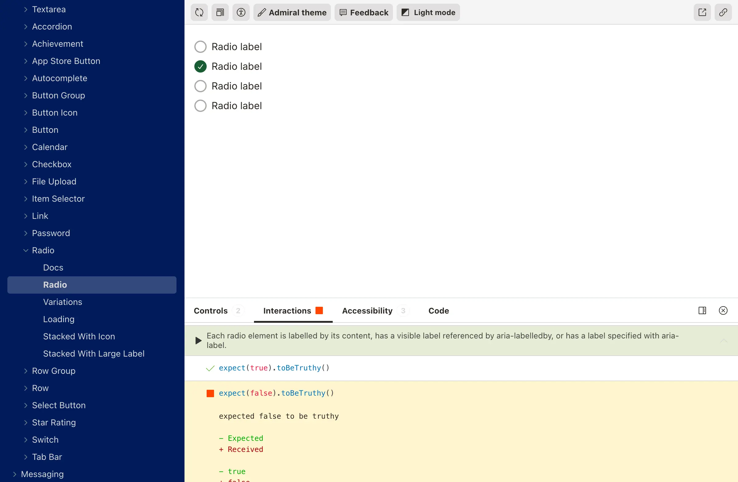
It tests all the things a sighted developer might not think to check, but that a keyboard or screen reader user depends on.
How it works
Permalink to "How it works" headingUsing it is deliberately simple. If you’ve got Storybook and the test runner set up, you install the package, import the relevant test function, and call it in your story’s play method:
import { a11yTabs } from '@etchteam/storybook-addon-a11y-interaction-tests';

export const Default = {
  play: async ({ canvasElement, step }) => {
    await a11yTabs({ canvasElement, step });
  },
};
That’s it. One import, one function call. Storybook now knows you’re claiming this component is a tabs implementation, and it will verify that against the W3C spec every time the test runner executes.
You can start small — a11yButton is a good first test to try — and work your way up to more complex patterns like comboboxes and carousels as you get comfortable.
Works everywhere, catches things immediately
Permalink to "Works everywhere, catches things immediately" headingA deliberate decision sits at the core of how these tests work: they bind to ARIA roles, never to class names or test IDs.
This matters for two reasons. First, it makes the tests reusable. Class names and test IDs change between projects, but role="tab" is role="tab" whether you’re building in React, Vue, or Stencil. Second, it enforces good HTML by design. If a test is looking for role="tabpanel" and your component doesn’t have one, the test fails — which is exactly what you want, because a screen reader user would have the same problem.
We get caught up in frameworks being magic, but what the user actually sees is a bunch of HTML that responds when you interact with it based on some JavaScript. It doesn’t matter whether that JavaScript is React or Stencil. The tests don’t care about your framework, and neither does the browser.
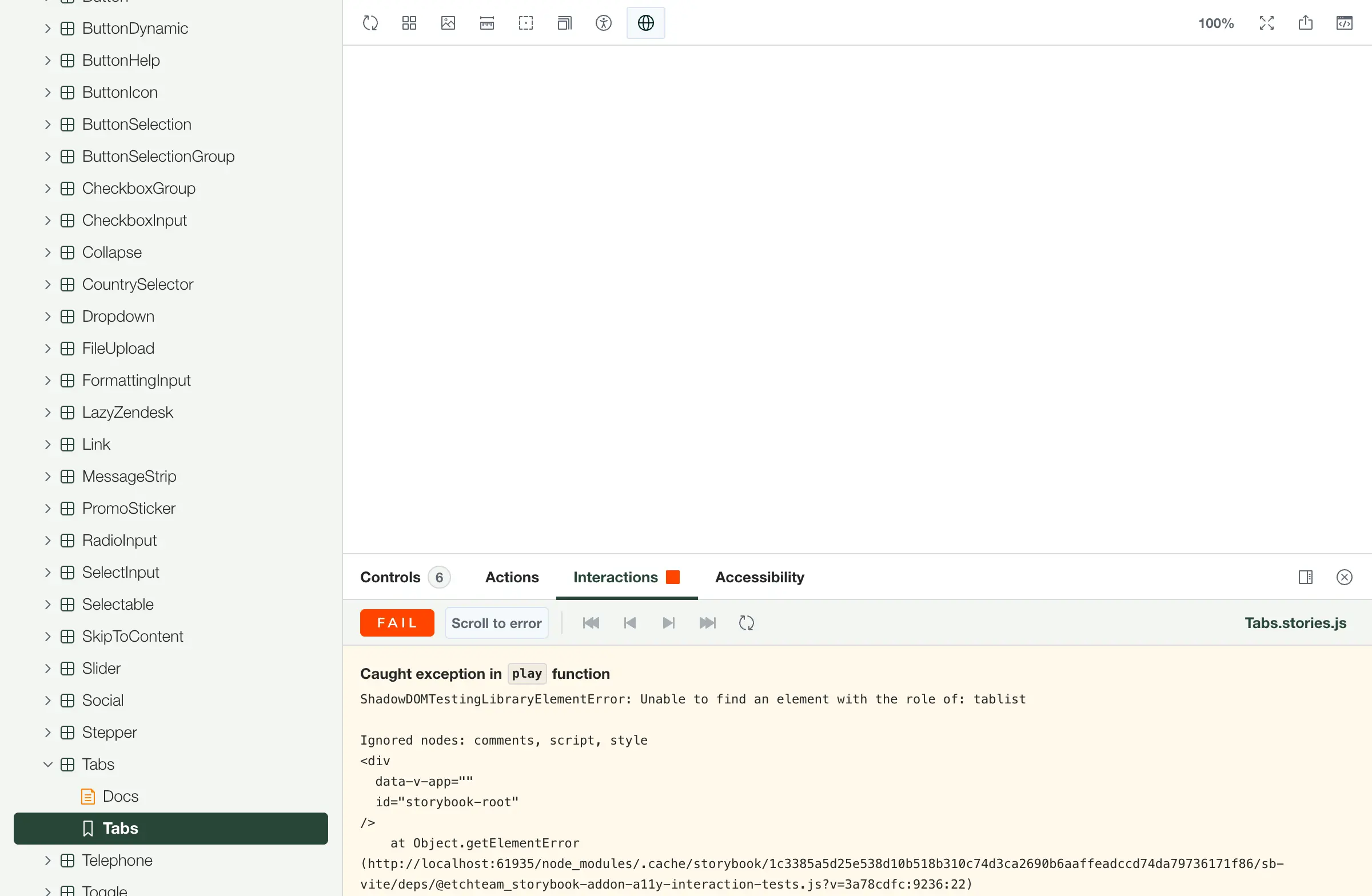
Every time we’ve rolled this out on a new design system, it’s caught issues straight away. Not dramatic, visible failures — the subtle kind.
Focus not landing in the right place after an interaction. An aria-expanded attribute not toggling correctly. Keyboard navigation skipping an option in a radio group. The sort of things that work fine if you’re clicking with a mouse but break the experience for anyone using assistive technology.
Accessibility-driven development
Permalink to "Accessibility-driven development" headingWhen we recently needed to build a tabs component for one of our clients, we imported a11yTabs into the story before writing any component code. Then we built the component to pass the tests. The result was a tabs implementation we could be completely confident about — not because we’d manually checked it, but because every keyboard interaction, every ARIA attribute, every focus behaviour had been verified against the spec automatically.
Building components test-first with accessibility specs means you’re not retrofitting accessibility after the fact. The accessible structure is the structure. It’s a fundamentally different way of working, and it produces better components faster.
What it doesn’t cover
Permalink to "What it doesn’t cover" headingThese tests handle interaction patterns, ARIA roles, states, and keyboard navigation. They don’t cover visual design — they can’t tell you whether something looks like a tabs component or whether your colour choices make sense. Storybook’s existing accessibility plugin handles contrast and markup quality, so the two complement each other well.
There are also a few patterns where the tests don’t cover every possible configuration. The carousel spec has rotation controls we haven’t implemented tests for, and some accordion configurations aren’t covered because our components didn’t need them. The package is open source specifically so other teams can contribute tests for patterns we haven’t hit yet.
And there’s a clear line where automation ends and human testing begins. A screen reader user will notice things no automated test catches — whether the reading order feels logical, whether announcements are helpful rather than just technically correct, whether the overall experience makes sense. These tests make sure the foundations are solid, but they’re not a replacement for testing with real people using real assistive technology.
Helping our clients stay confident
Permalink to "Helping our clients stay confident" headingWe built this initially while working on a clients design system, and being able to say “your components pass the W3C interaction specs, and they’ll keep passing them because the testing is automated” was a meaningful conversation. It gave the team genuine confidence that accessibility wouldn’t quietly regress as the system evolved.
The timing worked out neatly, too. The European Accessibility Act came into force in June 2025, right around when we were finishing this work. So what started as a craft-driven project became a practical way to help our clients prepare for compliance — though honestly, we’d have built it regardless.
The package is on npm and on GitHub. If you’re using Storybook with the test runner, you can be running accessibility interaction tests in about ten minutes.
Start with a button. Then try an accordion or tabs. You’ll be surprised what falls out — we were.
And if you want to get involved, the repo is open for contributions. There are patterns we haven’t covered yet and configurations we haven’t needed, so there’s plenty of room to help make this more complete.
What’s next
Permalink to "What’s next" headingIf we were starting from scratch today, we’d detach these tests from Storybook entirely. The interaction patterns and ARIA specs aren’t Storybook-specific — they’re web standards — so there’s no reason these tests should only run in one environment. That’s the direction we’re heading: making it so these tests can plug into any project, whether it uses Storybook or not.
Loads of people can make something that looks like a Figma mockup. Making something that works great for everybody — that’s the interesting part.